Improving Complex Ordering Flows
Redesigned a multi-step ordering process to simplify complex workflows, leveraging AI to automate data entry and help users complete orders faster and with fewer errors.
Overview
This project aimed to improve the usability of Evident’s CAD design ordering platform for dental professionals.
As the UX designer, I led user interviews and usability testing, then translated qualitative insights into a streamlined and trustworthy user experience, transforming a complex B2B workflow into something intuitive and accessible.
Throughout the project, I demonstrated strong analytical thinking by turning research findings into actionable design decisions, problem-solving skills by simplifying a multi-step ordering flow, and cross-functional collaboration by aligning closely with PMs and engineers to implement solutions effectively.
Client
Evident
Team
1 Product Designer, 1 UI Designer, 1 Product Manager, 2 Dev
Duration
2024 ~ 2025
Platform
Web
Background
Evident’s CAD design ordering platform was intended to help busy dental professionals complete orders quickly and accurately, but the actual user experience introduced several points of friction. Unclear top and bottom menu structures, unnecessary clicks, and inconsistent visual design often left users feeling confused and inefficient.
As the UX designer, I conducted user interviews and testing, then redesigned the complex ordering flow into an intuitive and trustworthy experience, making the B2B workflow simpler and more accessible.
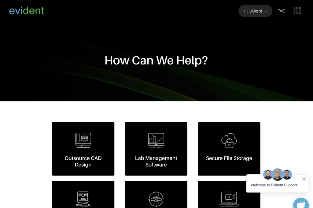
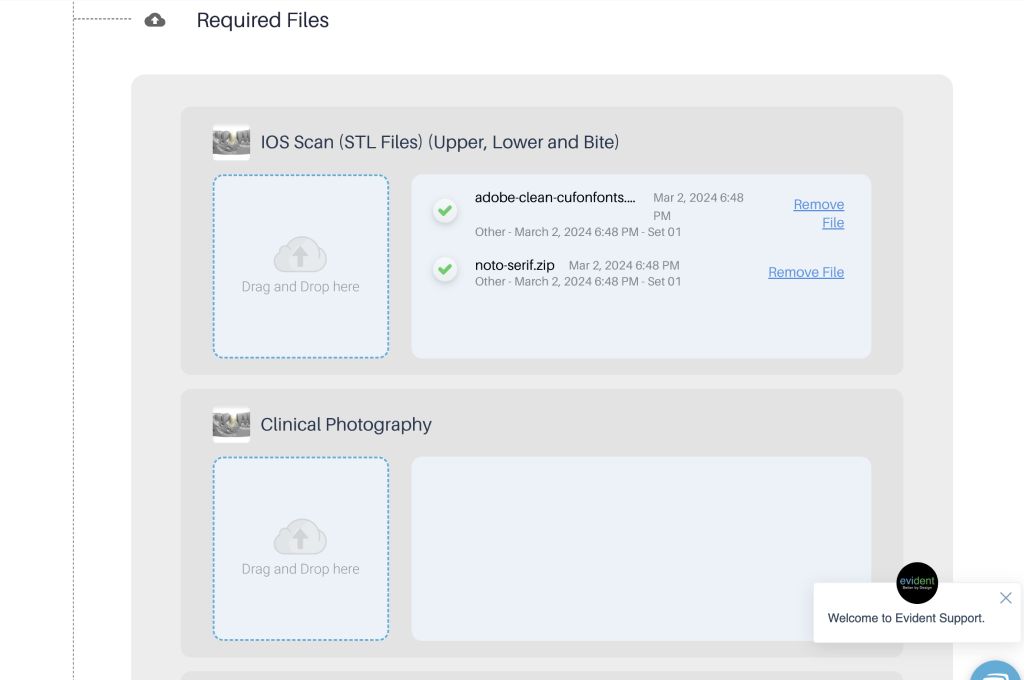
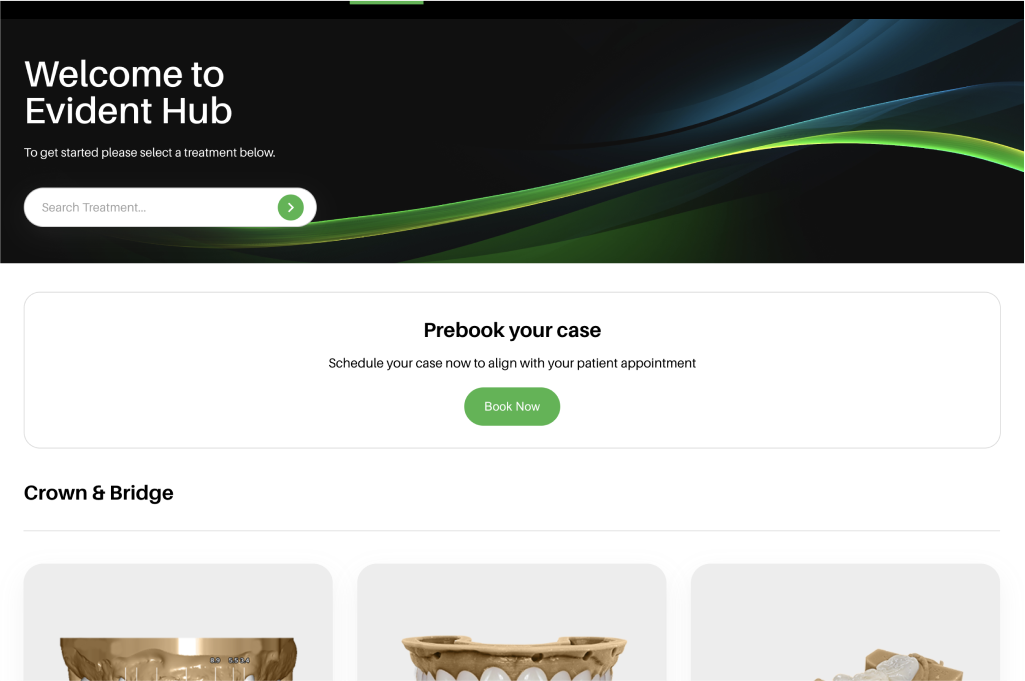
Before UI
Research & Planning
From October 28 to November 2, 2024, we conducted in-person usability testing and interviews with four dental professionals in Vancouver, Canada including dentists, hygienist, and front-desk staff.
Participants accessed the logged-in version of Evident Hub and were asked to complete two real-world order scenarios:
Place an order for the Smile Package (4crowns + 2 pontics)
Place an order for a single implant
I observed participants’ behavior where they hesitated, scrolled back, or got stuck and gathered qualitative feedback through structured interview questions.
Contextual User Research
Affinity Diagram based on Contextual User Research
Persona
The data we gathered from our usability testing and interviews helped us develop three distinct personas representing key user types within our target audience of dental professionals: a general dentist (Emily), a clinic receptionist (Anna), and an implant specialist (Dr. Eric)
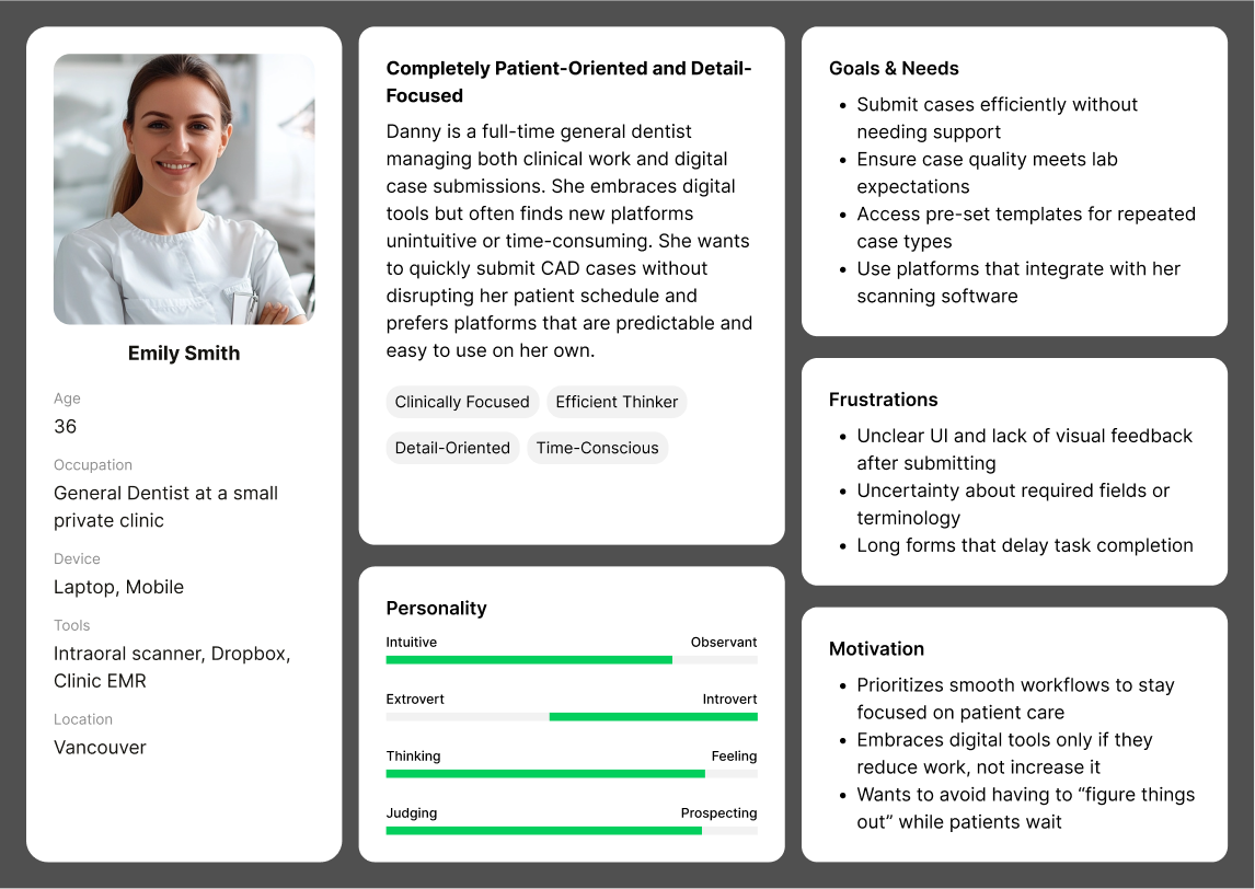
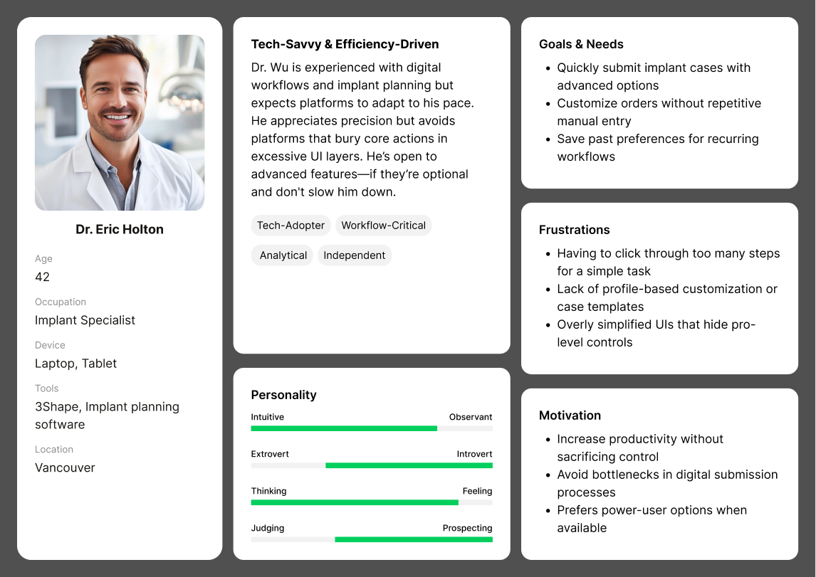
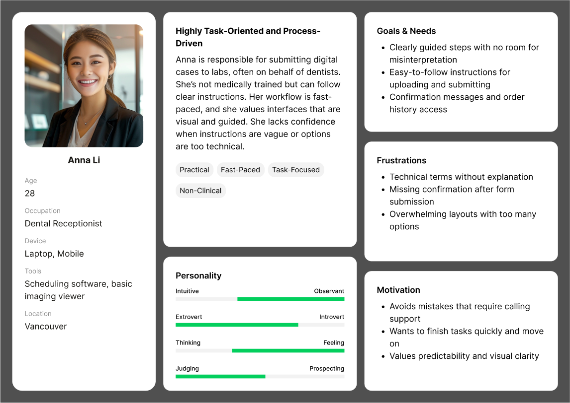
Each persona brought different expectations, pain points, and comfort levels with digital platforms. Emily needed clarity and speed to stay focused on patients; Anna valued simplicity and confidence in her task flow; and Eric, while tech-savvy, demanded performance, flexibility, and control.
Many of our design decisions were made with Emily in mind. As a solo general dentist juggling clinical and operational duties, she represented the largest and most friction-prone segment in our user base. If we could make the ordering experience smooth and stress-free for someone like Emily, it would naturally translate into an easier experience for less technical users like Anna — and still be fast and efficient enough to satisfy power users like Dr. Wu.
In other words, designing primarily for Emily gave us a foundation to address the full spectrum of user needs.
At this stage in the project, we also gathered internal stakeholder feedback and business objectives from Evident’s product team, which included expanding case volume and increasing platform stickiness. As we reviewed these priorities, we constantly evaluated how proposed design features would serve someone like Emily, while still aligning with Evident’s long-term platform vision.
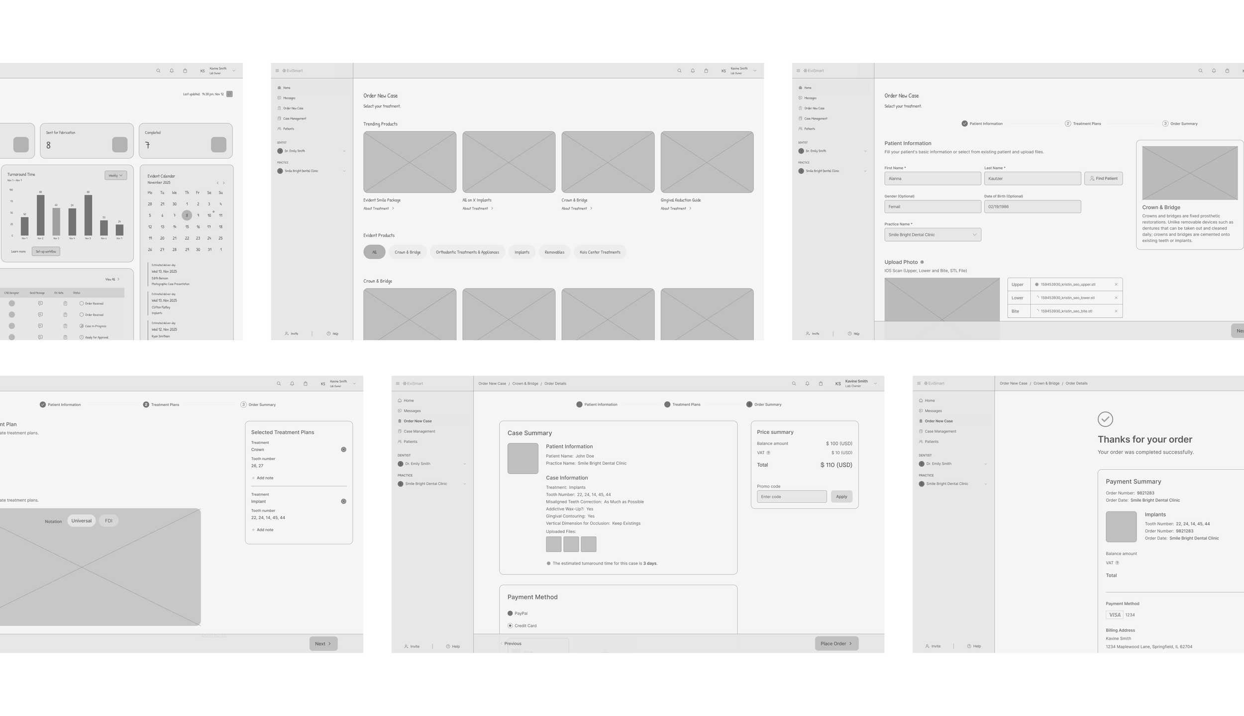
Wireframe
Before moving into high-fidelity design, I created low-fidelity wireframes to explore ways to simplify the ordering experience and reduce user hesitation.
The wireframes broke down the ordering flow into clear, step-by-step sections, supported by concise instructional text and a clear visual hierarchy to minimize cognitive load.
These early wireframes allowed us to quickly validate the layout and user flow through internal reviews and scenario-based walkthroughs, ensuring alignment across design, product, and engineering before transitioning to high-fidelity UI.
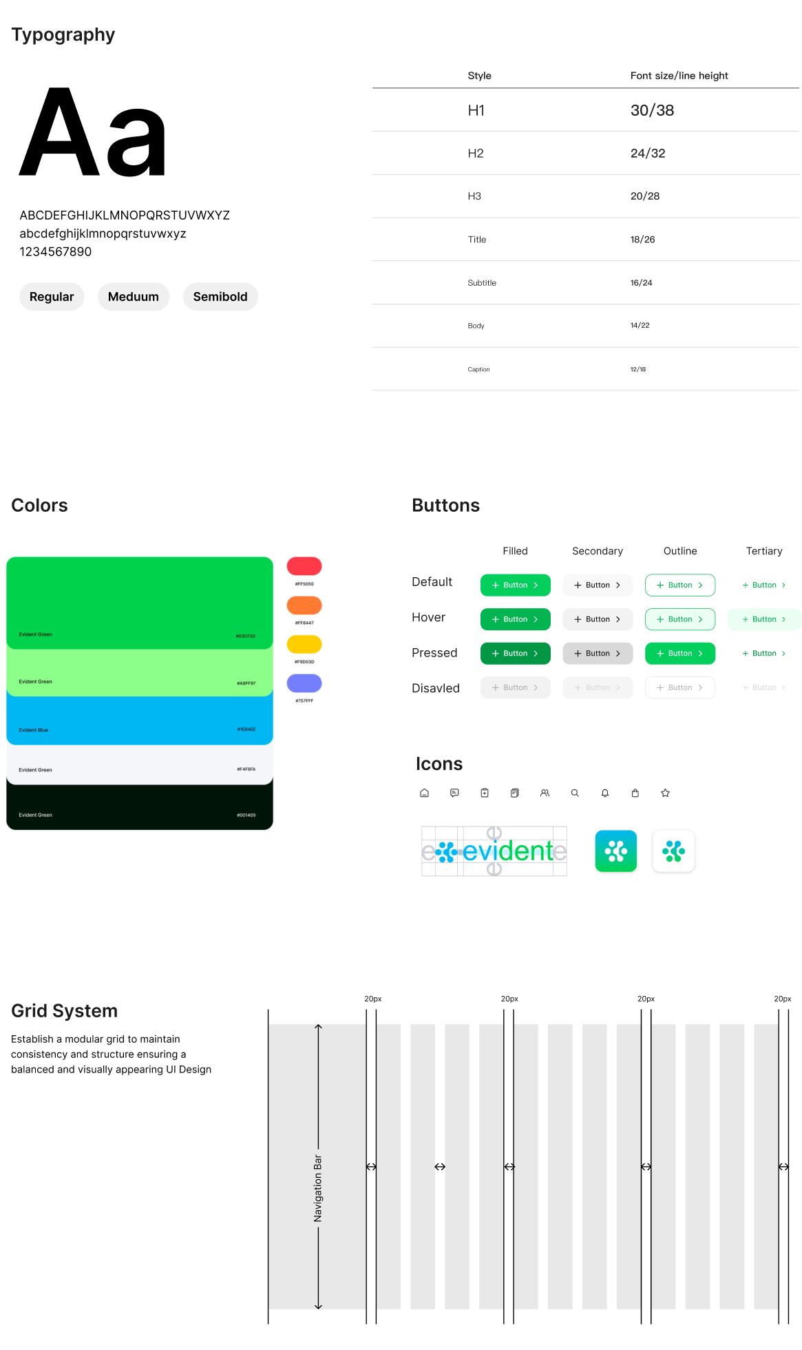
Design System
Before moving into high-fidelity design, I created low-fidelity wireframes to explore ways to simplify the ordering experience and reduce user hesitation.
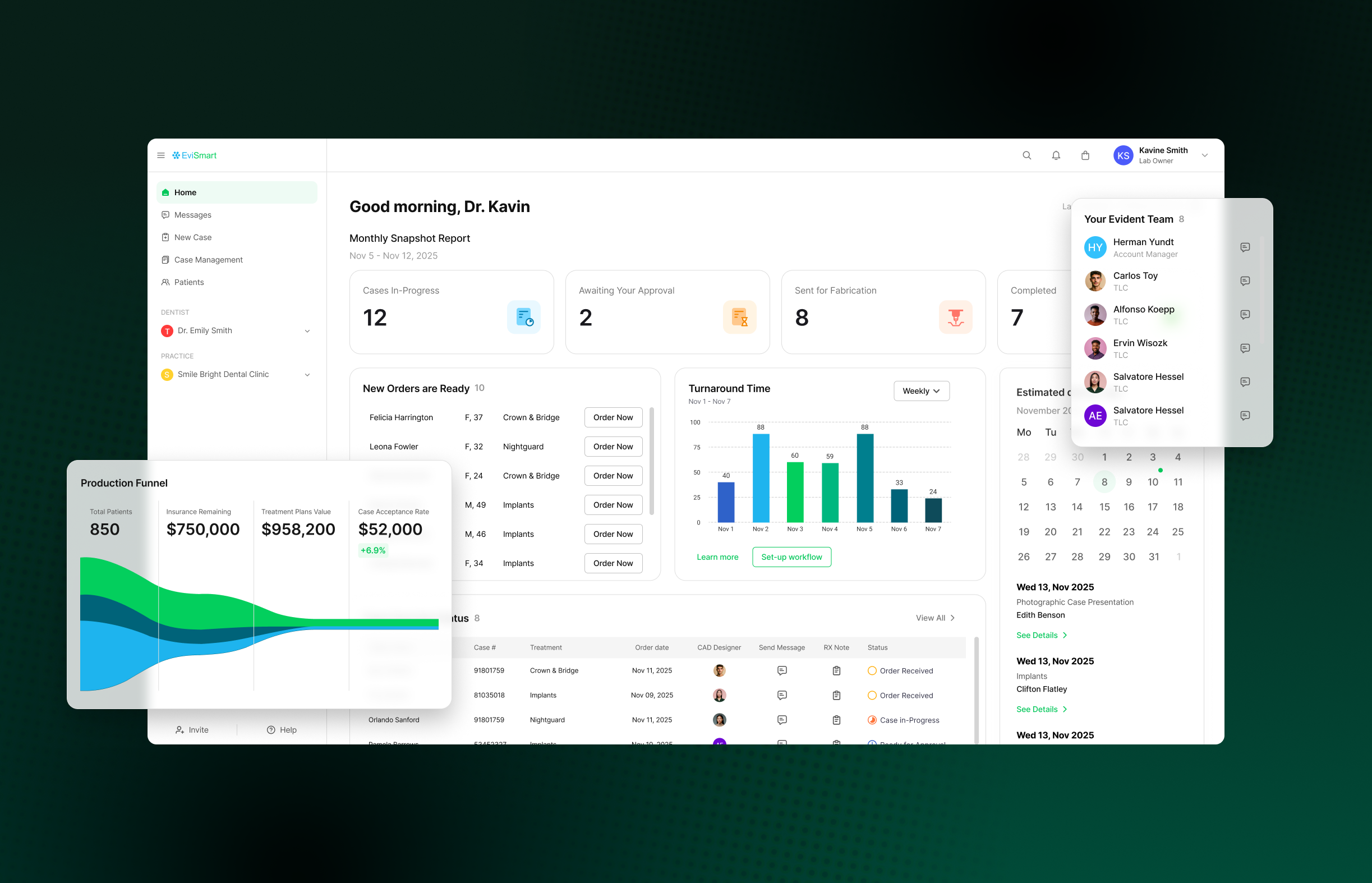
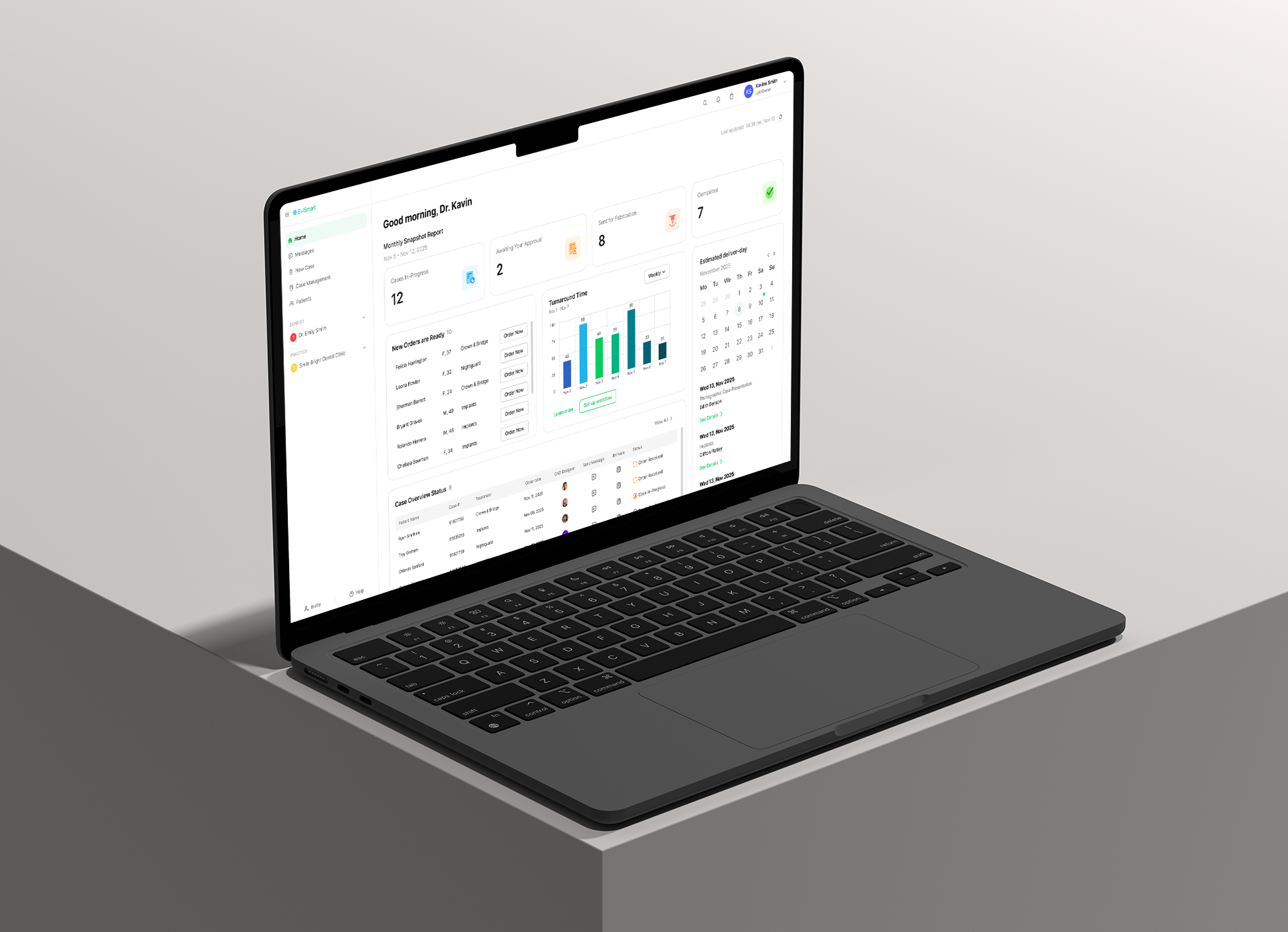
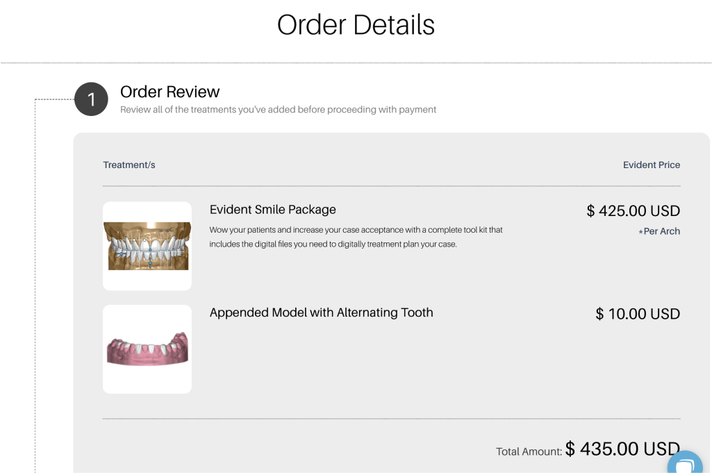
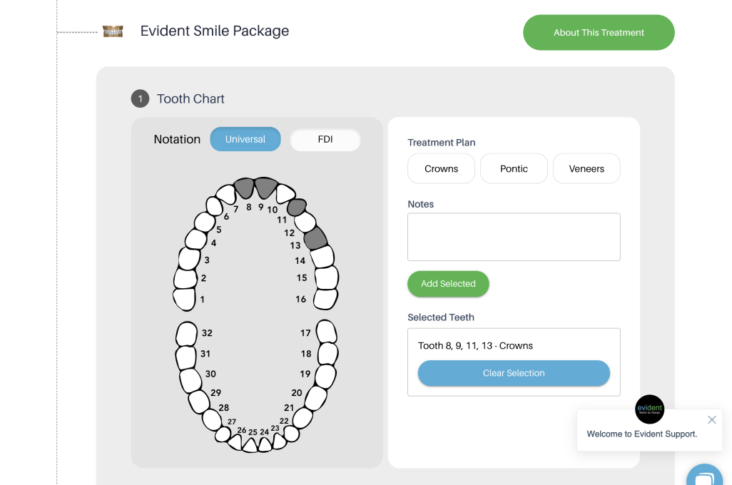
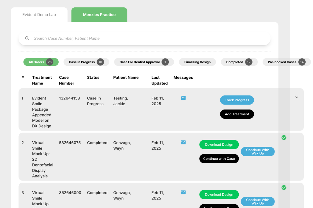
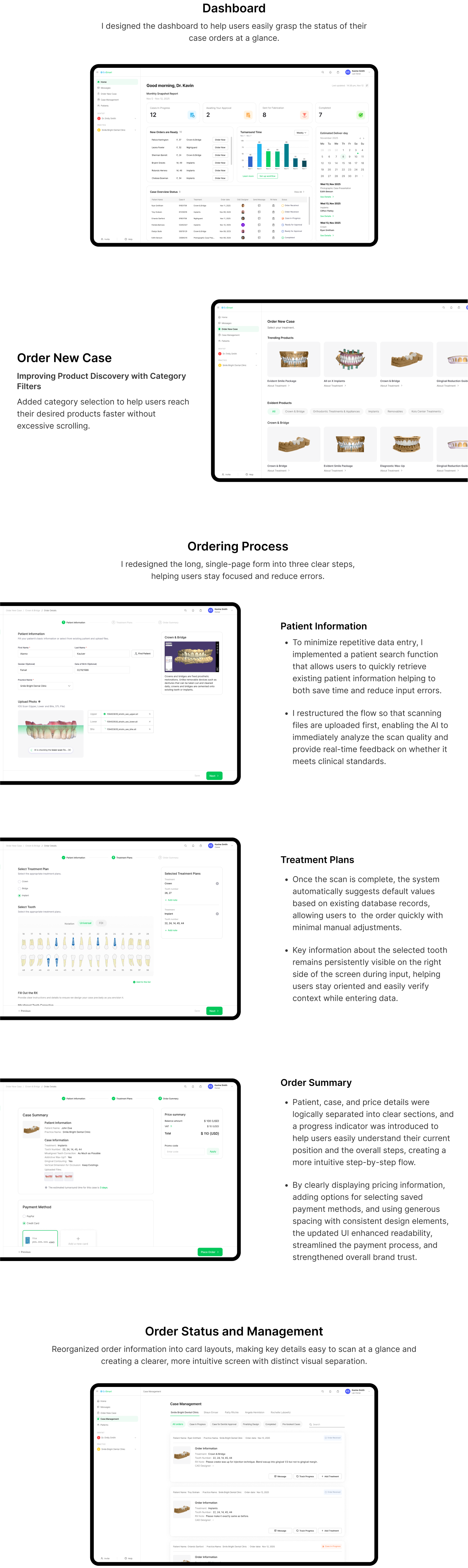
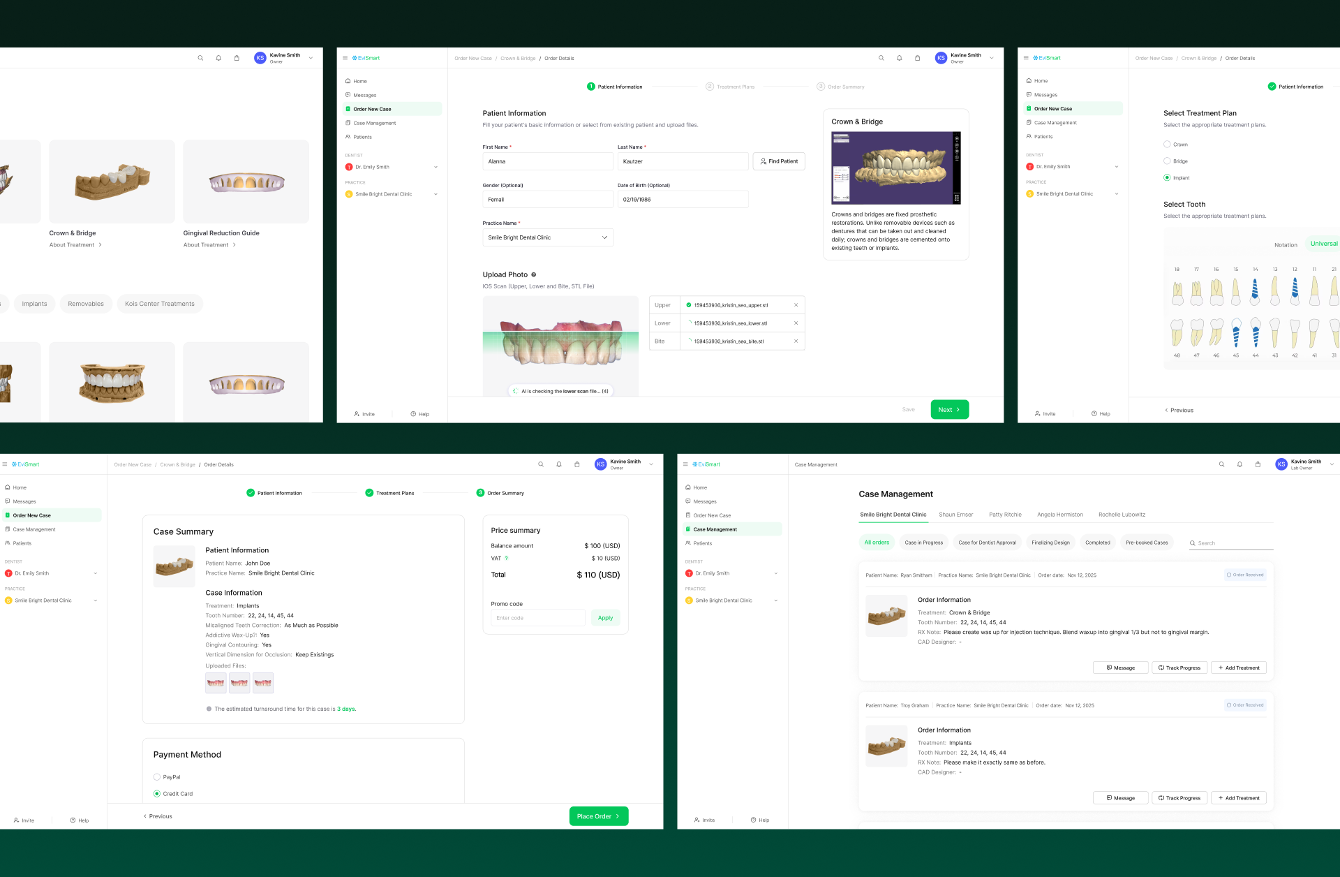
Final Result
Impact & Conclusion
The UX redesign of Evident Hub’s ordering flow significantly reduced friction across key user tasks.
By simplifying the previously complex multi-step case submission process, we achieved a 35% increase in case completion rates and saw a double-digit growth in user acquisition within three months.
This improvement laid a strong foundation for enhancing user trust and repeat usage, with especially noticeable impact among solo dentists and non-clinical staff.
Looking back, had we conducted deeper research into edge cases and exception scenarios during the process, we might have uncovered more nuanced opportunities for improvement.
Nonetheless, we were able to identify the core issues, propose clear, insight-driven solutions based on real user flows, and successfully align with both the product and engineering teams—leading to the integration of our recommendations into the actual product roadmap.
This project not only delivered meaningful short-term improvements but also influenced the long-term product strategy, reaffirming my belief that user-centered thinking can directly drive business outcomes.
It was a deeply rewarding experience as a UX designer, and I’m excited to see how the Evident platform continues to evolve moving forward.
Other Works
-
![]()
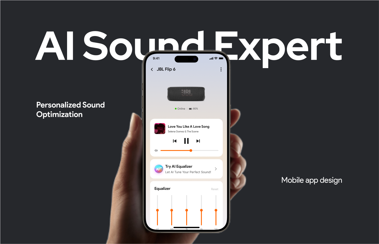
AI Sound Expert
-
![]()
Smart TV OS
-
![]()
Smart Home Remote Control